 Nov 05, 2025 - 0
Minutes read
Nov 05, 2025 - 0
Minutes read
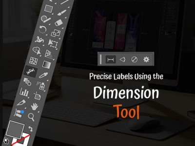
Improve Client Presentations with Precise Labels Using the Dimension Tool in Illustrator
Why Precision Matters in Client Presentations
In design presentations, clarity equals credibility. Clients look to your visuals not just for creativity, but for accuracy—understanding proportions, spacing, and structure. Precise measurements and labels show professionalism and intent, turning concepts into clear communication.
In Adobe Illustrator, the Dimension tool makes this easy by adding accurate annotations without disrupting design aesthetics. Whether for packaging, architecture, or product layouts, precision ensures clients see exactly what you envision.
Ultimately, accuracy builds trust. When your presentations are both creative and precise, they convey not just design but also confidence and craftsmanship.
Some of our links may be affiliate links and if you buy through our link, we might generate some commissions.

Introducing the Dimension Tool in Illustrator
The Dimension Tool in Adobe Illustrator brings clarity, accuracy, and professionalism to design presentations. It lets you add precise measurements and annotations directly to your artwork—integrating technical details without disrupting your creative flow.
Located in the toolbar or under Window > Toolbars > Dimensions, the tool allows you to click between points or edges to generate dimension lines and labels that automatically update as objects are resized—perfect for iterative workflows.
Beyond accuracy, it enhances communication and presentation. Customizable labels ensure measurements complement your design, making it ideal for product mockups, packaging, and architectural layouts.
What makes the Dimension Tool powerful is its ability to combine creativity and precision in one file. Designers no longer need separate software to show technical details—Illustrator now delivers visuals that are both aesthetically refined and technically precise, giving clients a clear, complete view of your design intent.
Discover Adobe's suite of products.

Setting Up for Accuracy: Preparing Your Artboard
Before adding dimensions or labels, it’s crucial to set up your Illustrator workspace for precision. A properly prepared artboard ensures every measurement, guide, and label aligns perfectly, giving your presentation a polished, professional look.
1. Set Up Your Artboard to Scale
- Determine the real-world dimensions of your project (packaging, signage, product mockup, etc.).
- Go to File > Document Setup to choose appropriate units (inches, millimeters, pixels, etc.).
- Keep units consistent across all elements for accurate and reliable dimensioning.
2. Enable Rulers, Guides, and Smart Tools
- Turn on rulers with Ctrl/Cmd + R and drag guides to mark alignment points.
- Use the Align panel to distribute elements evenly.
- Activate Smart Guides (Ctrl/Cmd + U) for automatic snapping and precise positioning.
3. Organize with Layers
- Create separate layers for artwork, annotations, and dimensions.
- Lock your main design layer before adding measurements to avoid accidental edits.
- Toggle layer visibility easily when sharing files with clients.
4. Use a Custom Grid System
- Enable View > Show Grid and View > Snap to Grid for consistent spacing and structure.
- Ideal for projects requiring repeated measurements or precise alignment.
5. Final Check
- Ensure all settings—scale, units, and guides—are accurate before dimensioning.
- A well-prepared artboard lets the Dimension Tool perform optimally, producing clean, consistent, and professional results
Discover Adobe's suite of products.

Adding Dimensions That Speak for Themselves
Once your artboard is set up, the Dimension Tool helps turn measurements into clear, visual communication. Well-placed dimensions let clients instantly understand proportions, scale, and structure—no extra explanation required.
1. Creating Dimensions
- Select the Dimension Tool from the toolbar.
- Click between two anchor points, edges, or corners to generate a dimension line with automatic measurement values.
- Dimensions are dynamic—they update automatically when objects are resized or moved, keeping annotations accurate.
2. Customizing for Clarity and Style
- Adjust line weight, arrowhead type, and text placement in the Properties panel to match your design’s tone.
- For technical drawings, use clean, legible formatting.
- For client presentations, apply thinner strokes or muted colors that blend with your artwork.
- Customize font, size, and color so labels enhance—not distract from—your design.
3. Adding Angular Dimensions
- Use the tool to mark angles and rotations by selecting two sides of an angle.
- Illustrator automatically calculates and displays the measurement—ideal for packaging dielines or 3D renderings.
4. Maintaining Consistency
- Keep spacing uniform between dimension lines.
- Avoid overlapping text or labels to maintain readability.
- Arrange annotations to guide the viewer’s eye naturally through the design.
5. Communicating with Confidence
By blending precision with presentation, your dimensions become more than measurements—they express intent, logic, and professionalism. Each line reinforces the credibility of your design, ensuring clients see both your creative vision and technical expertise at a glance.
Discover Adobe's suite of products.

Customizing Labels for Clarity and Style
Precise measurements matter, but presentation defines professionalism. Adobe Illustrator’s Dimension Tool lets you control typography, color, and placement—blending technical clarity with visual elegance. The goal: make your labels readable, consistent, and seamlessly aligned with your design aesthetic.
Start with typography, the foundation of legibility. Use clean, sans serif fonts like Helvetica, Source Sans, or Roboto for sharp readability, even at smaller sizes. Keep font size and weight consistent to avoid clutter, and slightly increase size or spacing for client-facing visuals to enhance on-screen or print clarity.
Next, refine your color choices. Labels should contrast with the background while staying subtle. Try neutral gray dimension lines with darker text, or use brand colors sparingly to highlight key details. On light backgrounds, mid-gray lines with black text maintain focus on the design while ensuring clarity.
Placement and alignment are key to polish. Use Smart Guides for even spacing and consistent alignment. Avoid overlaps with design elements, and orient labels logically—horizontal or vertical based on object structure. For angled or curved shapes, adjust manually to preserve readability.
Lastly, maintain visual balance. Labels should enhance, not compete with, your artwork. Group or layer annotations so you can toggle visibility when sharing different design stages.
By refining typography, color, and layout, your dimensions become more than measurements—they become part of your design’s visual language, reinforcing precision, clarity, and professional craftsmanship.
Discover Adobe's suite of products.

Enhancing Presentations with Visual Hierarchy
Precision only shines when paired with intentional design. In client presentations, too many annotations can clutter your work and dilute its impact. Establishing a visual hierarchy ensures your dimensions guide understanding rather than compete with your design.
Start by defining levels of importance in your annotations. Highlight key measurements—like overall height or width—with slightly larger or bolder text, while keeping secondary dimensions smaller or lighter. This variation naturally directs the viewer’s attention and creates a smooth visual flow.
Focus on placement and spacing for readability. Group related measurements logically and align them with object edges or along consistent axes. For complex designs, divide your layout into clearly labeled sections or panels, making it easier for clients to follow your presentation step by step.
Use color and contrast strategically. Maintain consistent tones for all dimension lines, reserving accent colors for focal points. Subtle, muted hues keep supporting measurements visible but unobtrusive, preserving a professional and cohesive look.
Balance is key—leave negative space so your design can breathe. Avoid overlapping labels or excessive detail. If necessary, create alternate or close-up views to highlight specific areas without overwhelming the main layout.
Ultimately, strong hierarchy turns dimensions into visual storytelling tools. Through alignment, restraint, and thoughtful emphasis, your annotations enhance comprehension while keeping the artwork at the center—achieving clarity, elegance, and compositional harmony.
Discover Adobe's suite of products.

From Draft to Delivery: Presenting with Confidence
Once your design is polished and annotated, the final step is preparing it for presentation—ensuring every line, label, and color remains crisp and consistent across all formats. A precise export workflow showcases your professionalism and design expertise.
1. Organize Before Export
- Separate annotations, artwork, and background elements into distinct layers
- Toggle visibility based on your audience — clients may need labeled visuals, while production teams require detailed specs.
- Use this setup to create multiple presentation versions from one Illustrator file.
2. Export for Digital Review
- Go to File > Export > Export As, then choose PDF or PNG for high-resolution results.
- Use PDF for vector clarity—labels and lines stay sharp even when zoomed in.
- Set your document to RGB color mode and embed fonts to ensure consistent viewing on all devices.
3. Export for Print
- Switch your document to CMYK color mode for accurate print colors.
- Export at 300 dpi or higher to preserve fine detail in lines and text.
- Include bleed and crop marks for full-page or edge-to-edge designs.
4. Create Presentation Layouts
- Arrange visuals in Illustrator or InDesign for a clean, cohesive presentation.
- Use grids, margins, and labeled callouts for structure.
- Add subtle background tones or dividers to guide focus without clutter.
5. Review Before Sending
- Double-check legibility, color accuracy, and alignment in your final export.
- Ensure all dimensions and annotations display correctly.
- Take time to verify—small details reinforce your precision and professionalism.
Discover Adobe's suite of products.

Elevate Every Project with Smart Labeling Practices
Precision labeling is more than a technical step—it’s a professional habit that enhances clarity and credibility. Establish a consistent labeling style with defined fonts, sizes, and colors, using Illustrator’s Graphic Styles or Templates to keep projects uniform and efficient.
Always check accuracy—verify units, alignment, and updates to dynamic dimensions. Keep your files organized with separate layers for artwork and annotations, locking completed elements to prevent errors.
When presenting, use restraint and hierarchy. Highlight key dimensions, apply subtle color contrasts, and maintain clean spacing to ensure readability without visual clutter.
Smart labeling reflects your attention to detail and design discipline, turning technical precision into clear, confident communication that elevates every project.
Discover Adobe's suite of products.